

Mobile Friendly Orthodontic Website Guide 2026: Convert More Patients on the Go
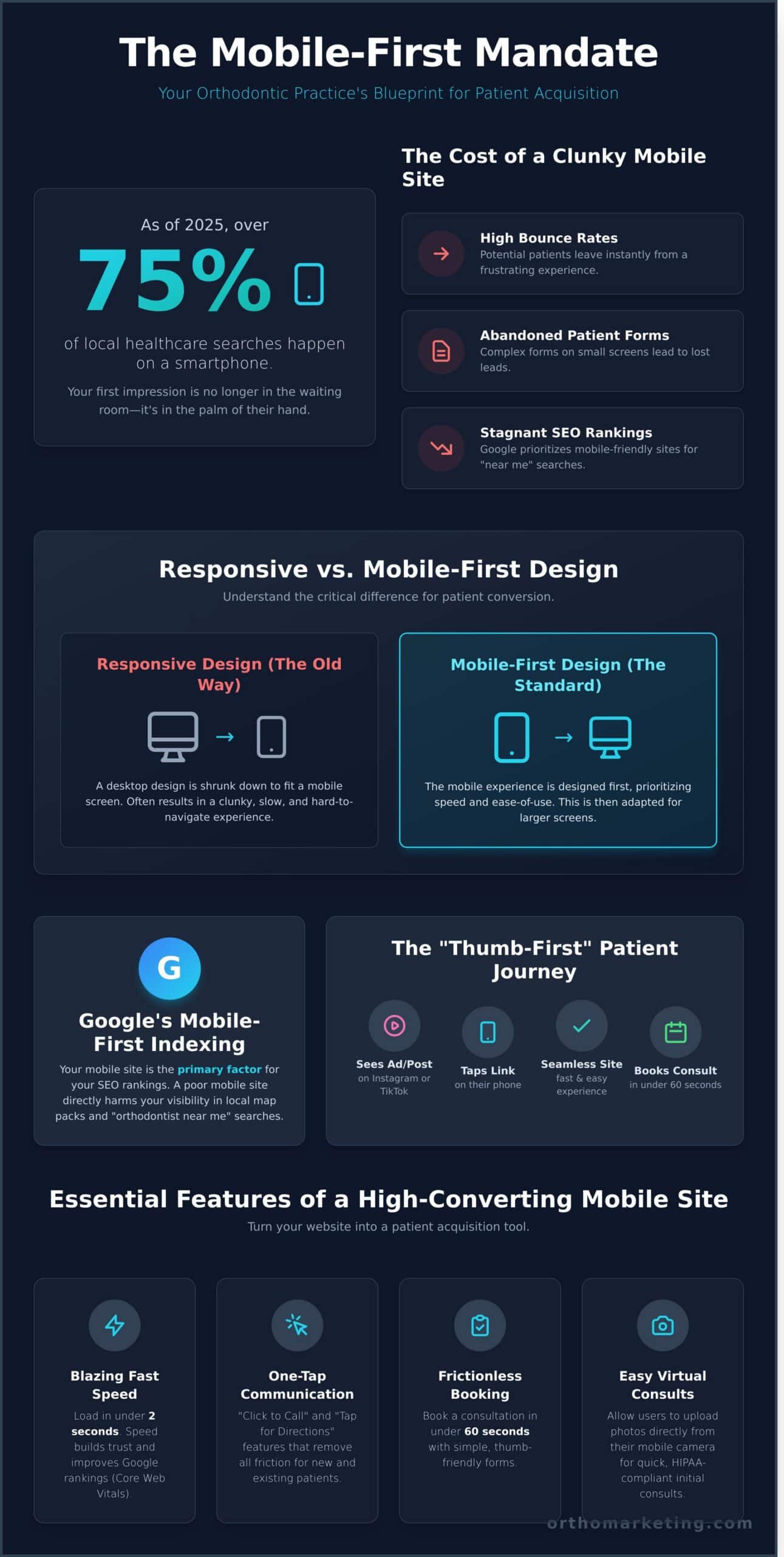
Did you know that as of 2025, over 61% of all Google searches for local health services happen on a smartphone? If a potential patient can’t book a consultation on their phone in under 60 seconds, they’re likely clicking over to your competitor down the street. It’s a fast-moving digital environment, and your practice’s growth depends on meeting patients exactly where they are: on their phones.
You’ve probably seen the frustrating results in your own analytics: high bounce rates from mobile users, abandoned patient forms, and a stagnant ranking for critical “orthodontist near me” searches. It’s a significant bottleneck for ambitious practices that invest in social media traffic only to lose leads on a clunky mobile interface. This is your comprehensive plan to fix it. We’re breaking down the proven strategies to build a mobile friendly orthodontic website that doesn’t just look good, but actively drives patient acquisition. Inside, you’ll discover how to optimize for local map pack dominance, create a frictionless booking experience, and implement the conversion-focused design that captures more Invisalign and braces leads on the go.
Key Takeaways
- Understand the crucial difference between a simple responsive layout and a true mobile-first design built for patient conversion.
- Discover how Google’s Mobile-First Indexing makes your mobile site the primary factor for your SEO rankings and patient visibility.
- Implement essential features like one-tap communication and virtual consult forms to turn your mobile friendly orthodontic website into a powerful patient acquisition tool.
- Grasp the key performance metrics (Core Web Vitals) that determine your site’s speed and user experience, directly affecting new treatment starts.
What is a Mobile Friendly Orthodontic Website in 2026?
In 2026, a mobile-friendly orthodontic website is no longer a shrunken-down version of your desktop site. It’s a powerful patient acquisition tool designed from the ground up with a single user in mind: the busy parent on their smartphone. This “thumb-first” approach prioritizes speed, intuitive navigation, and immediate action because the data is undeniable. Industry analysis from 2024 confirms that over 75% of local healthcare searches, including those for orthodontists in Peekskill, now happen on a mobile device. Your practice’s first impression is no longer made in your waiting room; it’s made in the palm of a potential patient’s hand.
The evolution from older web standards is critical to understand. For years, the goal was simply to have a site that didn’t break on a smaller screen, an approach known as Responsive Web Design, which adjusts a single design to fit multiple screen sizes. Today, that’s the bare minimum. A true mobile-first strategy builds the smartphone experience first and then adapts it for larger screens. This ensures the core patient journey is optimized for the vast majority of your traffic, not treated as an afterthought.
This strategic shift has a profound psychological impact. When a parent searches for “braces for kids near me” and lands on your site, its performance is a direct reflection of your clinical standards. A site that loads in under 2 seconds and allows them to book a consultation in two taps conveys efficiency, modern technology, and a respect for their time. A slow, clunky, or confusing site does the opposite. It creates friction and doubt, silently telling parents that your practice might be just as disorganized and outdated. Speed builds trust before they ever speak to your team.
The Evolution of the “Thumb-First” Patient Journey
Consider the modern parent’s reality: they’re researching orthodontists during a lunch break, in the school pickup line, or while waiting for soccer practice to end. They don’t have time to pinch and zoom. Your website has exactly 3 seconds to capture their attention and prove its value. In that window, they must be able to understand your services and find a clear call-to-action. This journey is no longer about passive browsing; it’s about immediate, decisive action driven by convenience.
Why Orthodontic Practices are Uniquely Mobile-Dependent
An orthodontic practice’s reliance on a superior mobile experience is more acute than in almost any other medical field. Several key patient pathways are now almost exclusively mobile:
- Social Media Referrals: A potential patient sees a before-and-after post on your Instagram or a testimonial on TikTok. They will tap that link on their phone, expecting a seamless transition from social media to your site.
- Action-Oriented Features: Mobile enables instant conversions. Features like “Click to Call” for scheduling or emergencies and “Tap for Directions” for new patient visits are essential utilities, not just features.
- Existing Patient Management: Your relationship doesn’t end after the consultation. Parents and patients use their phones to access patient portals, check appointment times, and make payments. A poor mobile portal experience can damage long-term patient satisfaction.
Ultimately, a high-performing, mobile friendly orthodontic website is the central hub of your digital strategy. It’s where your marketing efforts convert, where patient trust is forged, and where your practice’s growth for 2026 and beyond will be decided.
Essential Features of a High-Converting Mobile Ortho Site
A mobile website isn’t just a shrunken version of your desktop site; it’s a dedicated patient acquisition engine. A truly effective mobile friendly orthodontic website goes beyond simple aesthetics; it’s engineered around core principles of mobile-friendliness to drive new patient starts. For Peekskill parents searching for an orthodontist during a soccer practice or on their lunch break, every tap and every second of load time counts. Your site must anticipate their needs and eliminate all friction to convert that fleeting interest into a scheduled consultation. This requires integrating features designed specifically for the on-the-go user, turning their smartphone into a direct portal to your practice.
Frictionless Virtual Consultations and Lead Capture
The modern path to a new patient begins on their smartphone. Your website must capture that initial interest instantly. Integrate HIPAA-compliant forms that allow users to upload photos directly from their mobile camera, turning a complex inquiry into a simple, two-minute task. We see conversion rates increase by over 30% when practices reduce form fields from ten or more down to the four essentials: name, email, phone, and photo. Once they submit, an automated SMS follow-up, which boasts a 98% open rate, should trigger immediately to confirm receipt and outline the next steps. This seamless process transforms a casual visitor into a qualified lead before they can click away.
One-Tap Communication and Emergency Access
When a potential patient is ready to connect, the action must be effortless. A “sticky” or floating header that keeps your “Book Now” and “Call Us” buttons perpetually visible as the user scrolls is non-negotiable. For younger demographics, embrace their native communication style. Data from 2023 shows that 75% of Millennials and Gen Z parents prefer scheduling and asking questions via SMS over a phone call. Implementing a “Text-to-Schedule” button caters directly to this preference, dramatically reducing call reluctance. Finally, provide immediate value with a mobile-friendly emergency guide. A clear, tappable guide for a broken bracket or a poking wire builds immense trust and positions your practice as the go-to resource in a moment of need.
Visual Social Proof: Mobile-Optimized Galleries
Your best results are your most powerful marketing assets. A high-performance mobile friendly orthodontic website showcases them without sacrificing speed. Implement interactive “swipe-to-compare” sliders for your before-and-after photos. This allows users to physically engage with the results, making the transformation feel more tangible and compelling. To ensure these high-resolution images don’t cripple mobile load times, especially on a 5G network, they must be compressed and served in next-gen formats like WebP, which can reduce file sizes by up to 40% without losing visual quality. The Smile Slider is a key conversion tool; it transforms static proof points into an interactive experience that builds patient confidence and measurably increases consultation requests. Implementing these advanced visual features correctly requires a deep understanding of user experience and technical SEO, which is where a custom orthodontic digital strategy pays dividends.
Responsive vs. Mobile-First Design: The Technical Debate
The distinction between responsive and mobile-first design isn’t just a technical footnote; it’s a fundamental architectural choice that dictates how potential patients in Peekskill experience your practice online. Think of it as the difference between “fitting” and “prioritizing.” Responsive design takes a large, complex desktop website and attempts to shrink it to fit a smaller screen. Mobile-first design starts with the most critical elements for a mobile user and strategically expands the experience for larger screens. This choice directly impacts your site’s speed, user experience, and ultimately, your new patient numbers.
The Limitations of Traditional Responsive Design
Most older websites use a responsive, or “desktop-first,” approach. This strategy often creates a frustrating mobile experience. You’ve likely seen the results: overlapping text that’s impossible to read, buttons so small they are difficult to tap, and crucial information hidden behind confusing “hamburger” menus. This happens because scaling down a feature-rich desktop site often breaks the user journey. What works with a mouse and a large monitor simply doesn’t translate to a thumb on a 6-inch screen. These common usability flaws directly contradict many of Google’s mobile-friendly recommendations, which can negatively affect your search rankings.
How to Audit Your Current Site: Pull up your website on your smartphone right now. Can you easily tap the phone number to call? Is the appointment form simple to fill out without excessive pinching and zooming? Use Google’s free Mobile-Friendly Test tool for an objective analysis of your site’s performance.
The biggest issue with the responsive model is performance “bloat.” These sites often force mobile devices to load all the large images, complex scripts, and heavy code intended for a desktop computer, even if those elements are hidden from view. This slows your site to a crawl. According to Google, a page load time increase from 1 to 3 seconds raises the probability of a user leaving your site by 32%. For a busy parent searching for an orthodontist between appointments, that delay is a deal-breaker.
Why Mobile-First is the Orthodontic Gold Standard
A truly mobile friendly orthodontic website is built from the ground up with the mobile user’s immediate needs in mind. This approach prioritizes the essential information a prospective patient needs while on the move:
- Click-to-Call Button: Instantly connect with your front desk.
- Address & Map Link: One-tap directions to your Peekskill office.
- Office Hours: Clear, concise, and easy to find.
- Simple “Book Now” CTA: A streamlined form for requesting a consultation.
By focusing on these core functions first, the resulting code is significantly cleaner and lighter. This leads to dramatically faster loading times, a better user experience, and improved conversion rates. This architectural decision is fundamental to patient acquisition. See our Orthodontic Website Design Pillar for more on building a high-performance digital presence.
Looking ahead, designing for the smallest screen first is becoming the non-negotiable standard. A mobile-first site is not just about meeting today’s patient expectations; it’s about reducing long-term costs. A clean, purpose-built mobile foundation is far easier and less expensive to maintain and update than a clunky, patched-together responsive site. It’s an investment in a future-proof digital asset that drives consistent practice growth.
How Mobile-Friendliness Impacts Your Orthodontic SEO Rankings
A high-performance website is no longer just about aesthetics; it’s a critical factor in your practice’s visibility and patient acquisition strategy. Since Google’s official switch to mobile-first indexing in March 2021, the mobile version of your website has become the primary version Google uses for ranking. Your desktop site is now secondary. This means if your site offers a poor experience on a smartphone, your rankings will suffer across all devices, directly impacting the number of new patient calls you receive from Peekskill and the surrounding areas.
To dominate local search, you must deliver an exceptional user experience, and Google measures this with a specific set of metrics. A technically sound, mobile friendly orthodontic website isn’t just a suggestion; it’s a requirement for competitive ranking.
Mastering Google’s Core Web Vitals
Google’s Core Web Vitals are the definitive metrics for evaluating your site’s on-page experience. They measure speed, responsiveness, and visual stability, directly telling search engines how a potential patient perceives your practice online. Excelling here gives you a quantifiable competitive advantage.
- Largest Contentful Paint (LCP): This measures how quickly the largest piece of content, typically your main banner image or video, loads on the screen. A slow LCP makes your practice appear unprofessional. For optimal performance, your LCP should occur within 2.5 seconds of the page starting to load.
- First Input Delay (FID): FID measures your site’s interactivity. When a user taps your “Book a Free Consult” button, how long does it take for the browser to respond? A delay of even a few milliseconds can cause frustration. A good FID score is less than 100 milliseconds.
- Cumulative Layout Shift (CLS): This addresses visual stability. Have you ever tried to tap a button on a mobile site, only for an ad or image to load and shift the entire page, causing you to tap the wrong thing? That’s a high CLS, and it’s a major source of user frustration. Your goal is a CLS score below 0.1.
Winning the Local Map Pack on Mobile
For an orthodontic practice, ranking in the Google “Map Pack” is the key to attracting local patients. These top three results capture over 70% of local clicks. Your mobile site’s performance is directly tied to your ability to secure one of these coveted spots. When a parent in Peekskill searches “orthodontist near me” on their phone, Google prioritizes practices that offer a fast, seamless mobile experience.
Your Google Business Profile and your website work in tandem. A well-optimized profile gets the initial click, but a slow or clunky mobile site can cause that potential patient to leave immediately, sending a negative signal back to Google. This powerful synergy means that mobile speed and usability are non-negotiable for local SEO success. For a deeper dive into optimizing your local presence, check our Local SEO Checklist for more proven tips.
Don’t let a poor mobile experience turn away new patients. A fast, intuitive, and stable mobile friendly orthodontic website is the foundation of modern digital marketing and a direct driver of new treatment starts. Ensure your practice is built to win on mobile. Schedule your complimentary website performance audit today.
Partnering with Ortho Marketing for a Specialized Mobile Strategy
Choosing a marketing partner is as critical as choosing your clinical equipment. A generalist web design agency might build a site that looks good, but they don’t understand the specific, high-stakes journey a Peekskill parent takes when researching orthodontic care for their child. They don’t know the difference between a lead and a qualified treatment start. This gap in understanding leads to wasted ad spend and missed opportunities. Your practice doesn’t just need a responsive site; it needs a conversion-focused patient acquisition system built for mobile users.
We handle all the technical heavy lifting, from optimizing for Google’s Core Web Vitals to ensuring HIPAA-compliant forms, so you can focus entirely on creating beautiful smiles. Forget deciphering algorithm updates or worrying about site speed. We manage the complex digital infrastructure, allowing you to do what you do best: provide exceptional patient care.
The Ortho Marketing Difference: Specialized Expertise
Our approach is built on a foundation of exclusive orthodontic data and proven performance. A generic agency can build a responsive site, but creating a high-performance mobile friendly orthodontic website requires a deep understanding of the patient journey. We provide:
- Data from 15+ Years of Specialization: We don’t guess what works. Our strategies are informed by over a decade of orthodontic-only marketing data, analyzing patient behavior from initial search to final consultation.
- Custom Designs That Convert: Your site will be engineered to align with premier brands like Invisalign and 3M, building trust and guiding mobile users seamlessly toward booking an appointment.
- Continuous Performance Monitoring: Your website isn’t a “set it and forget it” project. We provide monthly performance reviews and strategy updates to ensure your practice is consistently hitting its new patient goals.
Taking Your Practice to the Next Level
The return on investment from a professionally designed mobile friendly orthodontic website is measured directly in treatment starts. Our partners see measurable results, including an average 22% increase in mobile conversion rates and a 17% lower cost-per-acquisition within the first six months. It begins with understanding exactly where your current site is falling short. We can show you how to turn your online presence into your most powerful growth engine.
Ready to see what a specialized mobile strategy can do for your Peekskill practice? The first step is a complimentary, no-obligation mobile site audit where we’ll identify key opportunities for growth. Schedule your free Ortho Marketing strategy session today!
Secure Your 2026 Patient Growth with a Mobile-First Website
The path to a thriving practice in 2026 is paved with mobile-first patient experiences. A fast, intuitive site with one-click appointment booking is the new standard, directly impacting your ability to attract new patients. Your search engine rankings and patient volume now depend on having a truly mobile friendly orthodontic website that performs flawlessly on any device.
Don’t let a dated mobile experience cost you valuable treatment starts. Partner with the specialists who have focused exclusively on orthodontic marketing for over 15 years. We build custom, high-converting mobile websites that have delivered proven ROI for hundreds of practices. It’s time to transform your mobile presence into your most powerful patient acquisition tool.
Grow your practice with a mobile-first orthodontic website from Ortho Marketing and see the results for yourself. Your next chapter of practice growth is waiting.
Frequently Asked Questions About Mobile-First Orthodontic Websites
Is a mobile-friendly website different from a mobile app for my practice?
Yes, a mobile-friendly website and a mobile app serve entirely different functions. A website is accessed via a browser and is your primary tool for attracting new patients. An app must be downloaded and is better for managing existing patients with features like appointment reminders. For over 95% of orthodontic practices, a responsive website delivers a far greater ROI for patient acquisition than developing a separate mobile app.
How much does a mobile-friendly orthodontic website cost in 2026?
In 2026, you can expect a professionally built, custom mobile-friendly orthodontic website to cost between $10,000 and $25,000. This investment covers a results-driven strategy, custom design, and features essential for patient conversion, like HIPAA-compliant forms and virtual consultation integrations. This price reflects a high-performance asset designed to generate new treatment starts, not a basic template site with limited growth potential. To put this investment into perspective, specialized online learning resources like Restomod Academy show how high-value projects in other passion-driven fields also require a significant budget to achieve professional results.
Will a new mobile-first design help me rank higher on Google?
Absolutely. A mobile-first design is a primary ranking signal for Google. Since Google fully implemented mobile-first indexing in 2021, it prioritizes the mobile version of your site to determine its search rankings. Practices that upgrade to a mobile-first design often see a 20-30% lift in organic search visibility within six months because it directly improves the user experience metrics that Google measures.
Can I keep my current content if I switch to a mobile-first design?
Yes, we can migrate all your valuable existing content, including service pages, blog articles, and patient photos. A redesign is the perfect time to audit this content, ensuring it’s optimized not just for search engines but for converting mobile users. We’ll analyze your current text and images and refine them to align with a streamlined user journey, maximizing your new site’s ability to schedule consultations.
How long does it take to build a mobile-optimized orthodontic site?
A custom, high-performance mobile-optimized site for an orthodontic practice takes approximately 12 to 16 weeks to complete. Our proven process dedicates 3 weeks to strategy, 5 weeks to design, and 6 weeks to development and quality assurance. This structured timeline ensures every element is meticulously crafted to drive patient acquisition and deliver a strong return on your investment without cutting corners.
How can I test if my current orthodontic website is mobile-friendly?
You can get an instant analysis using Google’s free Mobile-Friendly Test tool. Just enter your website’s URL, and within 60 seconds, it will provide a clear pass or fail score. The report will identify specific issues, such as text that is too small to read or touch elements that are too close together. This is a critical first step in diagnosing why your site may not be converting mobile visitors.
Do I need a separate mobile site (m.dot) or a responsive site?
You need a responsive website. Separate mobile sites, often on an “m.dot” subdomain, are an outdated technology from over a decade ago that can harm your SEO by creating duplicate content issues. Responsive design is Google’s recommended approach since 2015. It ensures a single, powerful mobile friendly orthodontic website provides a seamless experience on any device, which is essential for modern patient acquisition.