

TLDR
A professional personal brand for your dental practice is built from consistent logos, color palettes, typography, and imagery that signal clinical credibility and directly influence whether prospective patients book a consultation or choose a competitor. This visual identity system creates recognition and reinforces your positioning in the patient’s mind.
Search engine optimization helps dental and orthodontic practices appear in search results when prospective patients look for care online. For a broader overview, visit Seo Practices Dental.
- Why Visual Brand Identity Matters for Dental Practice Growth
- The Core Visual Elements of Professional Dental Branding
- Brand Consistency Across Patient Touchpoints
- Audit Your Current Visual Brand
- Common Visual Branding Mistakes That Erode Patient Trust
- Developing a Custom Brand Identity for Your Practice
- Key Considerations and Next Steps
- Summary
- How Does Visual Branding Build Patient Trust?
- What Are the Key Steps to Refresh Your Dental Practice Brand?
- FAQ
Why Visual Brand Identity Matters for Dental Practice Growth
Your practice communicates professionalism and clinical credibility through multiple channels—your website, Google Business Profile, social media, and physical signage. Each touchpoint sends a message about your attention to detail and operational excellence. A fragmented or outdated visual identity undermines that message and creates doubt, even when your clinical work is excellent.
Visual branding is not decoration or a cost center. It is a patient acquisition and credibility system directly tied to booking conversion rates. Practices with consistent, professional visual identities report higher patient confidence and fewer objections during initial consultations. The visual brand becomes the visible proof of your operational excellence before a patient ever sits in your chair.
The Core Visual Elements of Professional Dental Branding
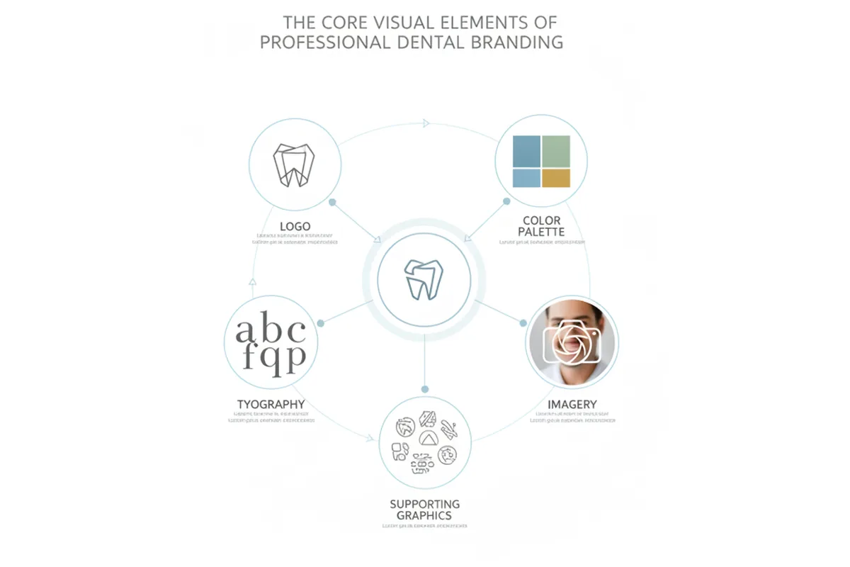
A professional visual brand identity system typically includes several core elements: logo design, color palette, typography, imagery style, and supporting graphics. Each element communicates something specific about your practice and contributes to a cohesive, professional appearance. When these elements work together consistently across all channels, they create recognition and reinforce your positioning in the patient’s mind.
Logo Design and Recognition
Your logo is the anchor of your visual identity. An effective dental practice logo should be simple, memorable, and scalable across sizes so it works equally well on a business card, a website header, and a large exterior sign. A logo that demonstrates professional design thinking maintains clarity even when reduced to small sizes on mobile screens or favicons. Overly complex designs or logos misaligned with your practice positioning undermine credibility and create the impression of an amateur operation.
A strong dental logo often incorporates subtle references to teeth, smiles, or healthcare without becoming cartoonish or gimmicky. The best logos work in both color and black-and-white, scale down to favicon size without losing clarity, and remain recognizable even when reduced to a small size on a mobile screen.
Color Psychology and Patient Perception
Color plays an important role in dental branding and patient perception. Blues and greens are commonly used in healthcare branding because they convey trust, stability, and cleanliness. Green suggests growth, health, and natural wellness. Warmer tones like coral or soft orange can communicate friendliness and approachability, which works well for pediatric practices or family-focused positioning.

Your color palette should include a primary brand color, one or two secondary colors, and neutral background colors. This limited palette creates visual consistency and makes it easier to maintain brand coherence across all materials. When colors shift from your website to your social media to your office signage, patients notice the inconsistency and question your attention to detail.
Typography, Imagery, and Consistency
Font selection reinforces your brand personality. A modern sans-serif font communicates contemporary professionalism, while a serif font can suggest tradition and established expertise. Your typography should remain consistent across your website, email signatures, social media, and printed materials. Mixing multiple fonts or using different font weights inconsistently creates visual chaos and undermines professionalism.
Imagery style—whether you use professional photography, illustration, or a combination—should feel cohesive in tone and quality. Before-and-after photos, team portraits, and patient education images should all follow the same aesthetic. Inconsistent imagery, such as mixing high-quality professional photos with casual smartphone pictures, signals that your practice lacks attention to detail.
Brand Consistency Across Patient Touchpoints
Visual brand consistency across all patient touchpoints—website, Google Business Profile, social media, signage, and communications—creates a unified professional presence. Every interaction a prospective patient has with your practice should feel like they are encountering the same professional entity.
Map your major touchpoints: your website homepage and service pages, Google Business Profile listing, Facebook and Instagram profiles, email templates, patient intake forms, business cards, appointment reminder emails, text messages, office signage, and waiting room materials. Each of these should display your logo consistently, use your brand colors, and reflect your typography and imagery style. When a patient sees your logo on your website, then encounters a different version on your Google listing, then sees yet another version on your social media, they experience visual fragmentation that erodes confidence.
The cost of inconsistency is real: patients may assume your practice is disorganized, outdated, or less professional than competitors with cohesive visual identities. The value of consistency is equally real: it builds recognition, reinforces your positioning, and creates the impression of a well-managed, detail-oriented practice. A brand guidelines document—even a simple one—helps ensure that anyone creating materials for your practice maintains visual consistency.
Audit Your Current Visual Brand
Practices can strengthen their visual brand by assessing logo consistency, color palette alignment, typography usage, imagery style coherence, and tone uniformity across all channels. Start by gathering materials from all your touchpoints: screenshots of your website, Google Business Profile, Facebook, Instagram, and any other platforms where your practice appears. Print out business cards, appointment reminders, and any signage photos. Lay them all out and ask yourself these questions:
- Does the logo appear consistently across all channels, or does it vary in size, color, or style?
- Are your brand colors used consistently, or do they shift from channel to channel?
- Is your typography consistent, or are different fonts used across different materials?
- Do your images and photography feel cohesive in style and quality, or do they look like they come from different practices?
- Does your tone and messaging feel unified, or does it vary significantly across channels?
Identify gaps and inconsistencies that may undermine credibility. Quick wins might include updating your Google Business Profile photo to match your website branding, ensuring your social media profile pictures use your official logo, or standardizing your email signature across your team. Areas that need professional attention might include a logo refresh, a new website design, or professional photography to replace outdated images.
Common Visual Branding Mistakes That Erode Patient Trust
Common visual branding mistakes include inconsistent logos, mismatched colors, outdated imagery, and lack of brand guidelines. These mistakes are more common than you might think, and they accumulate over time as practices add new materials without maintaining consistency.
Using outdated logos signals that your practice is behind the times. A logo from 2005 may have been professional then, but today it communicates that your practice has not invested in modernization. Mismatched colors across channels—a blue logo on your website but green on your social media, for example—create visual confusion and suggest disorganization. Inconsistent fonts and tone make your practice feel fragmented and unprofessional.
Unprofessional imagery, such as low-quality smartphone photos mixed with professional photography, signals that your practice cuts corners. Lack of brand guidelines means that different team members, contractors, or agencies create materials that do not align with your visual identity. Each of these mistakes is correctable, and the investment in fixing them pays dividends in patient confidence and booking conversion rates.
Developing a Custom Brand Identity for Your Practice
Guide your practice through the decision: refresh an existing brand or build from scratch. Start by answering these key questions: What is your practice positioning and target patient? Are you a high-end cosmetic practice, a family-focused general dentistry practice, or a specialized orthodontic clinic? What emotions and values should your visual identity communicate—professionalism, warmth, innovation, trustworthiness? How does your brand differentiate from competitors in your area?
A brand identity system includes more than just a logo. It encompasses your color palette, typography, imagery guidelines, tone of voice, and how all these elements work together across different applications. A brand guidelines document—even a simple one—ensures consistency as your practice grows and adds new team members or materials.
If you are building a brand from scratch or refreshing an existing one, consider whether to execute the work internally or engage professional branding and design support. Internal teams may lack the design expertise or time to create a cohesive system. Professional branding partners bring experience from working with multiple practices and can help you avoid common mistakes while creating a distinctive identity that reflects your positioning.
Key Considerations and Next Steps
Visual branding is a strategic investment, not a cost. A professional visual brand identity directly influences patient acquisition and booking conversion rates. The first step is to audit your current brand and identify gaps in consistency. Clarify your practice positioning and the emotions you want your visual identity to communicate. Then decide whether to execute a refresh internally or engage professional branding and design support.
If you choose to work with a branding partner, evaluate their experience with dental and orthodontic practices specifically. Look for partners who understand patient psychology, practice operations, and the competitive landscape in your market. Ask to see case studies and examples of work they have done for other practices. Discuss the scope of work: Will they develop a new logo, color palette, and typography system? Will they create brand guidelines? Will they help implement the new brand across your website, social media, and other touchpoints?
For practices in Peekskill and beyond seeking comprehensive branding solutions, exploring Seo Practices Dental provides frameworks for integrating your visual identity with your overall marketing approach. Additional resources cover 5 Ways To, Brand Orthodontic Practice, Logo Brand Identity, and Om Ep 24 to explore specific branding elements and strategies in greater depth.
Summary
A professional visual brand identity—built from consistent logos, color palettes, typography, and imagery—becomes the visible proof of your clinical credibility and operational excellence. Patients form trust judgments within seconds based on visual cues, making your brand identity a critical factor in whether they book a consultation or move to a competitor. By auditing your current visual brand, identifying gaps in consistency, and either refreshing your identity internally or engaging professional support, you create a foundation for patient acquisition and practice growth.
How Does Visual Branding Build Patient Trust?
Visual branding builds patient trust by creating a consistent, professional impression across all touchpoints. When a prospective patient encounters your practice online and in person, they form rapid judgments about your credibility based on visual cues: your logo, colors, typography, and imagery quality. A cohesive visual identity signals that your practice is organized, detail-oriented, and trustworthy. Inconsistent or outdated branding, by contrast, creates doubt and suggests that your practice may lack attention to operational excellence.
The visual brand becomes a proxy for clinical quality in the patient’s mind, influencing whether they choose to book a consultation.
What Are the Key Steps to Refresh Your Dental Practice Brand?
Refreshing your dental practice brand involves several key steps: First, audit your current visual identity across all touchpoints to identify inconsistencies and gaps. Second, clarify your practice positioning, target patient, and the emotions you want your brand to communicate. Third, decide whether to execute the refresh internally or engage professional branding support. Fourth, develop or update your logo, color palette, typography, and imagery guidelines. Fifth, create a brand guidelines document to ensure consistency as your practice grows.
Finally, implement the new brand across your website, social media, signage, and all patient-facing materials. Each step builds on the previous one, creating a cohesive visual identity that reinforces your positioning and builds patient confidence.
FAQ
What makes a logo effective for a dental practice?
An effective dental practice logo is simple, memorable, scalable across different sizes, and timeless rather than trendy. It should work equally well on a business card, website header, and large exterior sign. The best logos communicate professionalism without becoming cartoonish, and they remain recognizable even when reduced to small sizes on mobile screens or favicons.
Why does color matter in dental branding?
Color influences patient perceptions of trust, cleanliness, and professionalism. Blues and greens communicate calm and healthcare authority, while warmer tones suggest approachability. A limited, consistent color palette across all touchpoints reinforces your brand identity and creates visual coherence that builds patient confidence.
How do I know if my visual brand is inconsistent?
Gather materials from all your touchpoints—website, Google Business Profile, social media, business cards, signage—and compare them side by side. Look for variations in your logo, colors, fonts, imagery style, and tone. If your logo looks different on your website than on your social media, or if your colors shift across channels, your brand is fragmented and needs alignment.
What is a brand guidelines document, and do I need one?
A brand guidelines document specifies how your logo, colors, typography, and imagery should be used across all materials. It ensures consistency as your practice grows and new team members or contractors create materials. Even a simple one-page document helps maintain visual coherence and prevents the gradual erosion of your brand identity.
Should I refresh my logo if it is outdated?
An outdated logo signals that your practice has not invested in modernization, even if your clinical work is excellent. A logo refresh can communicate that your practice is current and professional. However, a refresh should maintain enough visual continuity that existing patients still recognize your practice. A professional designer can help you modernize your logo while preserving brand recognition.
How does visual branding affect patient booking rates?
A professional, consistent visual brand builds confidence and reduces objections during consultations. Practices with cohesive visual identities report higher booking conversion rates compared to those with fragmented or outdated branding, because the visual identity communicates that your practice is organized, detail-oriented, and trustworthy.
Educational note: This article is a general guide to visual branding principles for dental and orthodontic practices. It does not replace professional design consultation or strategic business advice tailored to your specific practice. Visual branding outcomes depend on many factors including your market, positioning, implementation quality, and integration with your overall marketing strategy. Results and effectiveness vary by practice.


